


Weekly Writers: How Original Should A Book Cover Be?
Half and half
Here’s the Weekly Writers Monday post. This post is for paid subscribers only. If you’d like to become one, you get 50% off the annual subscription if you click the button below!
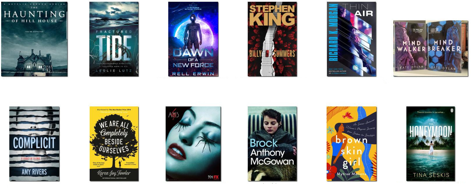
A book cover designer is not necessarily aiming at beautiful art. Many designers say covers shouldn’t be unique; instead, they should follow the expected template of the genre. I have to admit that I only partially agree with that.
Copying a style exactly can lead to bland and derivative repetition. That applies to text and stories as much as book covers. It can be the plague of traditional publishers who make decisions based on what sold well last year, creating me-too bandwagons that are always behind the trend. It’s why suddenly zombie books and TV shows and films were everywhere, until you’re so sick of them you feel like you’re one of the living dead yourself. If I look for a psychological thriller and every book has the same yellow text and visual design, it bores me. When everything is vanilla, how do you choose between things? Instead I’ll be drawn to the thing that looks different, interesting, perhaps hoping the writing and plot is also somehow fresh and different rather than same old same old.
As with any guidance, bear in mind that it is all subjective. Any rule adopted by everyone ends up becoming staid and predictable (which includes writing: don’t get me started on how many stories the concept of Chekhov’s Gun has ruined).
The trick is to reinforce the message of what kind of book it is, whilst also promising something that isn’t generic and copycat. It’s a fine balance, but you don’t have to slavishly copy the way everyone else has done it.
You must never mislead readers. If misery lit is presented with a romance cover, romance readers will be upset by the dark content. People are rightly annoyed if they expect one thing and are given another, even if both are good quality. The cover must give the right message for the genre. But within that broad area, there are millions of delightful alternatives.
Top Tip: Examples Of Quality
Buy a stack of books in your genre, or get them from a library. Ideally the books should be both recent and successful. Read the books, but also analyse everything about them: the interior and cover design, blurbs, and reviews (what people did or didn’t like). This can be really useful in terms of giving you pointers for designing and marketing your own books to the same audience.
But then take it further. How? Let me explain.
Keep reading with a 7-day free trial
Subscribe to Karl Drinkwater’s Words & Worlds to keep reading this post and get 7 days of free access to the full post archives.