


Weekly Writers: Fonts And Typefaces
Know your letters
Here’s the Weekly Writers Monday post. This post is for paid subscribers only. If you’d like to become one, you get 50% off the annual subscription if you click the button below!
Generally a font is a specially designed set of letters in a unified style on a computer, whereas a typeface is used in printing. But since books are always designed on a computer nowadays, many people use the terms interchangeably. So, for example, Times New Roman can be both a font and a typeface.
An ebook reader usually lets the reader set the font (so the font used in the book’s master file is irrelevant), but in a print book the decision is made during its design. The font choice has implications for readability and mood. It also affects page count, since not only do some fonts have wider letters, but the point size also needs selecting. Page count affects printing costs.
Fonts can be divided up in many ways, but I think of them as three main types. Serif, sans serif, and decorative.
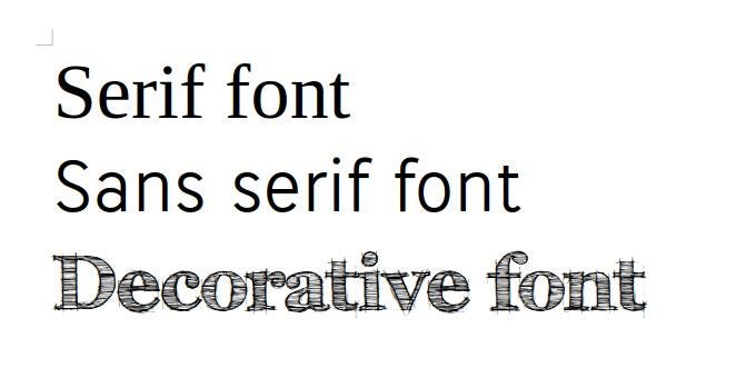
Let’s define each:
Keep reading with a 7-day free trial
Subscribe to Karl Drinkwater’s Words & Worlds to keep reading this post and get 7 days of free access to the full post archives.