


Weekly Writers: A Book Cover’s Purpose
Let's be clear
Here’s the Weekly Writers Monday post. This post is for paid subscribers only. If you’d like to become one, you get 50% off the annual subscription if you click the button below!
A book cover is the first thing a reader sees. It needs to be distinctive and appealing enough to grab the reader’s attention and tempt them to pick up the book (or click on a link) and look inside, to find out more.
As such, a book cover is for the reader, not the author.
It should communicate as precisely as possible the genre, and can hint at other things such as themes, setting, and dominant mood. This can be done partly though words, but also via:
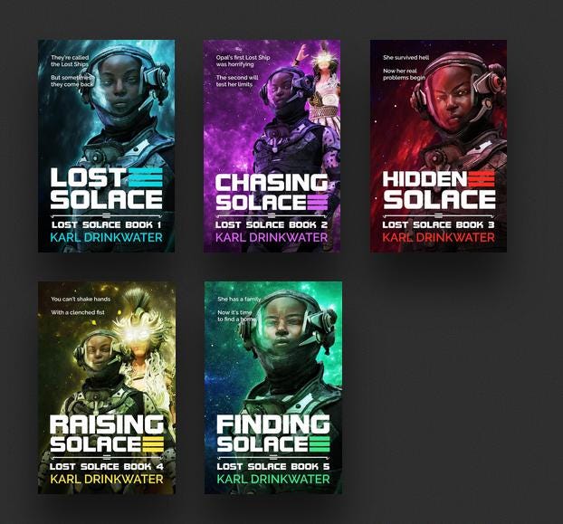
the images chosen and the style applied to them: the grunge of horror, versus blurs representing speed in thrillers, versus the bright postcard cartooniness of cosy mysteries;
colour schemes: horror may be in greys, blacks and reds, but a romance might use bright pastel colours;
fonts chosen: fantasy might have ornate fonts that look like polished steel, versus the battered and spiky fonts implying horror or thriller, or the whimsically curved fonts of light romance. Likewise the fonts for non-fiction are carefully chosen to imply seriousness, stability, fun, or anything else relevant to the topic.
When done well the cover should be like a film poster, where you can glance at it and already have a good idea of what genre the film is from the complex shorthand techniques intended to convey that information to us.
The final design should be clear, with text elements easily readable. A strong cover helps to sell the book, whereas a weak cover will hurt sales.
If you’re trade published you’ll likely have no say in the cover, but if you publish independently then you’ll probably hire someone to design it.
Remember that working with a cover designer is a two-way process. When you give them a description of a scene in minute detail, down to the exact design on the background teacup, and the designer says that’s not necessary, and that it is better to give a general idea – they’re right. We can’t be too precious about it. The cover is meant to pull in new readers, not act as a catalogue of a scene full of details that will mean nothing to the reader that has yet to read the book – and, in fact, will put them off even buying it if the cover is overcomplicated. So yes, the cover may introduce the protagonist or other characters, or some aspect of them, such as the cigarette and handcuffs of a chain-smoking detective, but it needn’t reproduce every freckle.
Keep reading with a 7-day free trial
Subscribe to Karl Drinkwater’s Words & Worlds to keep reading this post and get 7 days of free access to the full post archives.